
Color Psychology
COLOR PSYCHOLOGY IN THE ART WORLD
Adapted from an article by: Durga Chapagai, Zack Patterson, Morgan Thomas, Joe Weibel

The Connection Between Color and Art
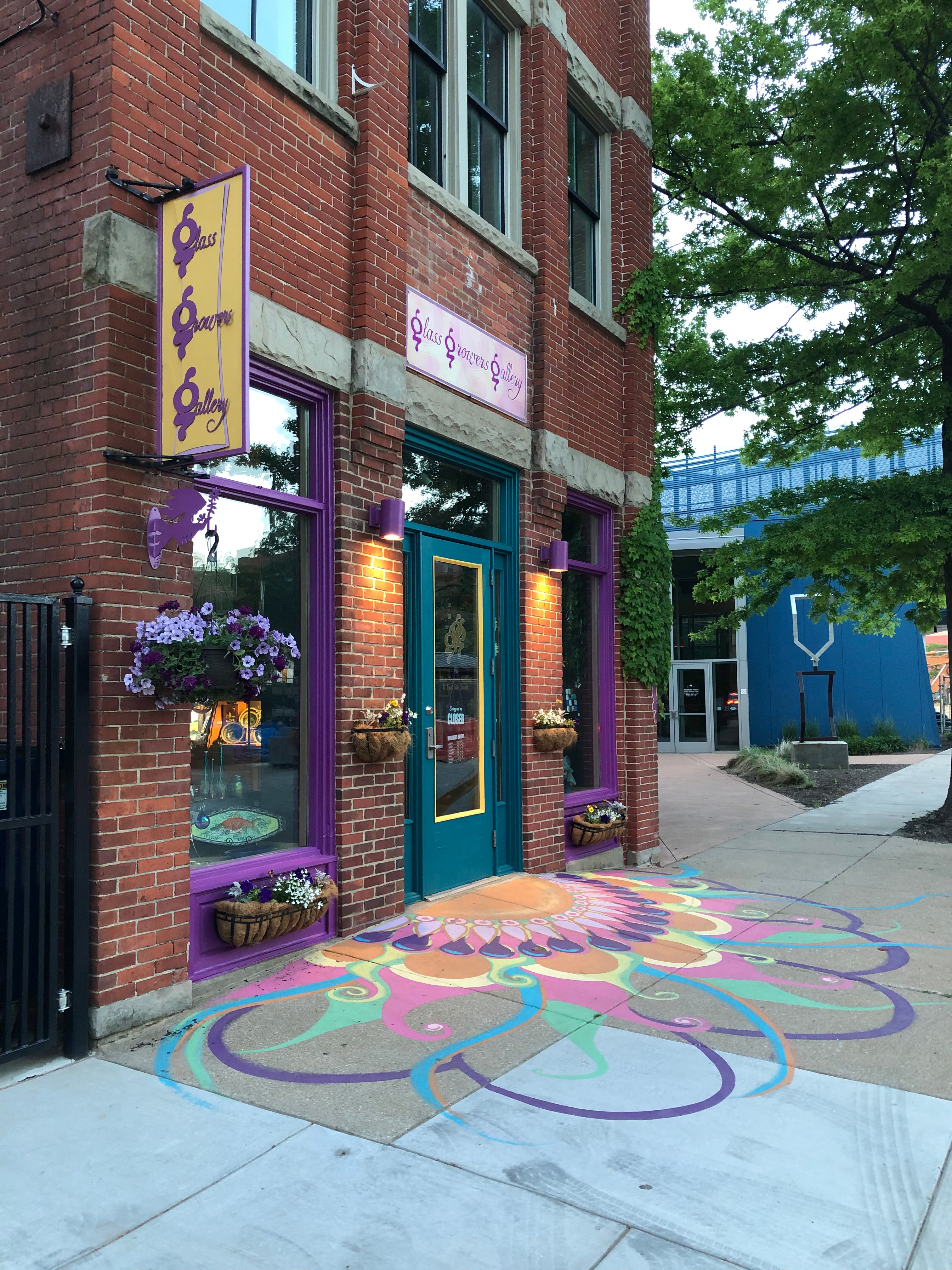
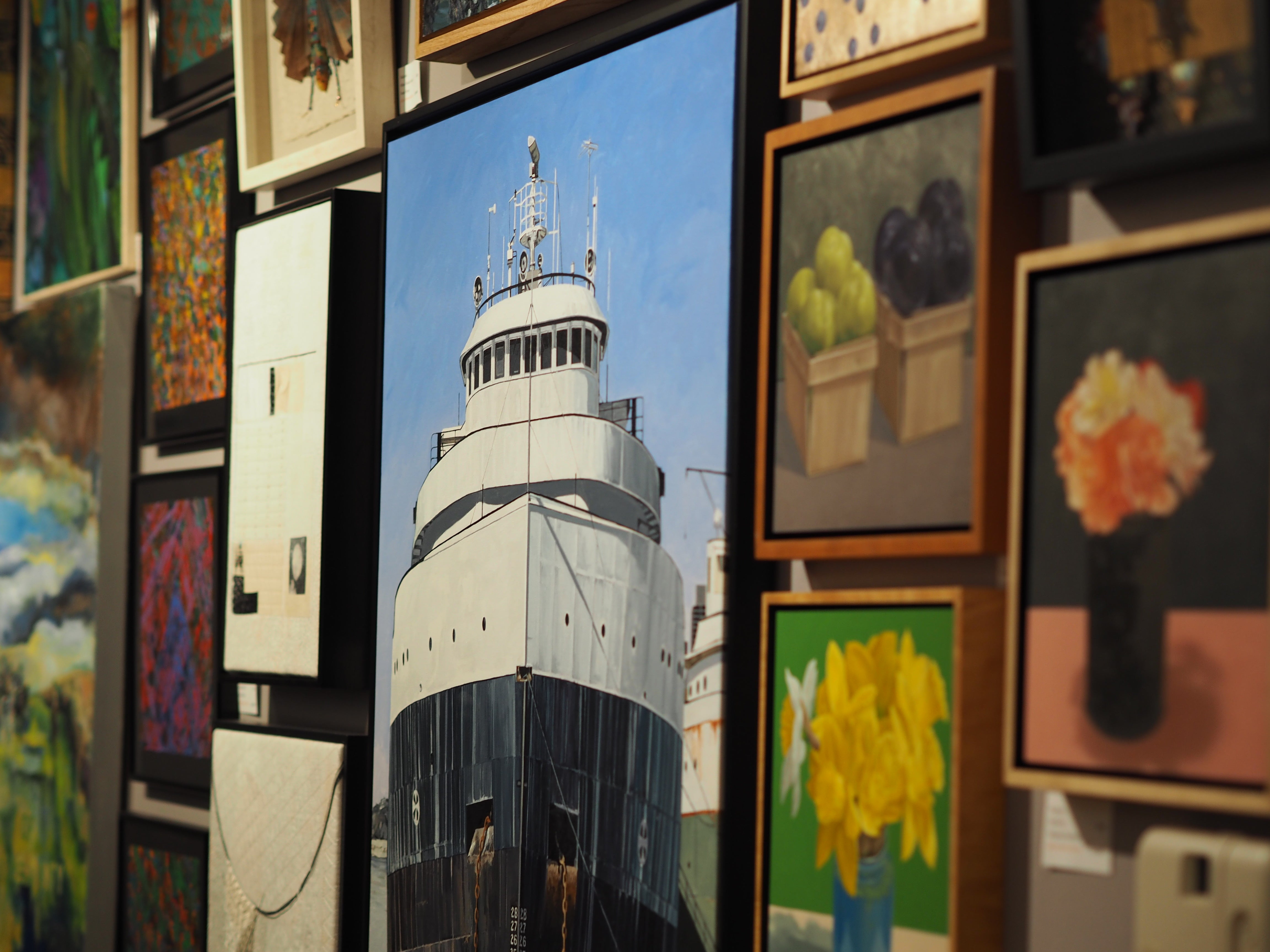
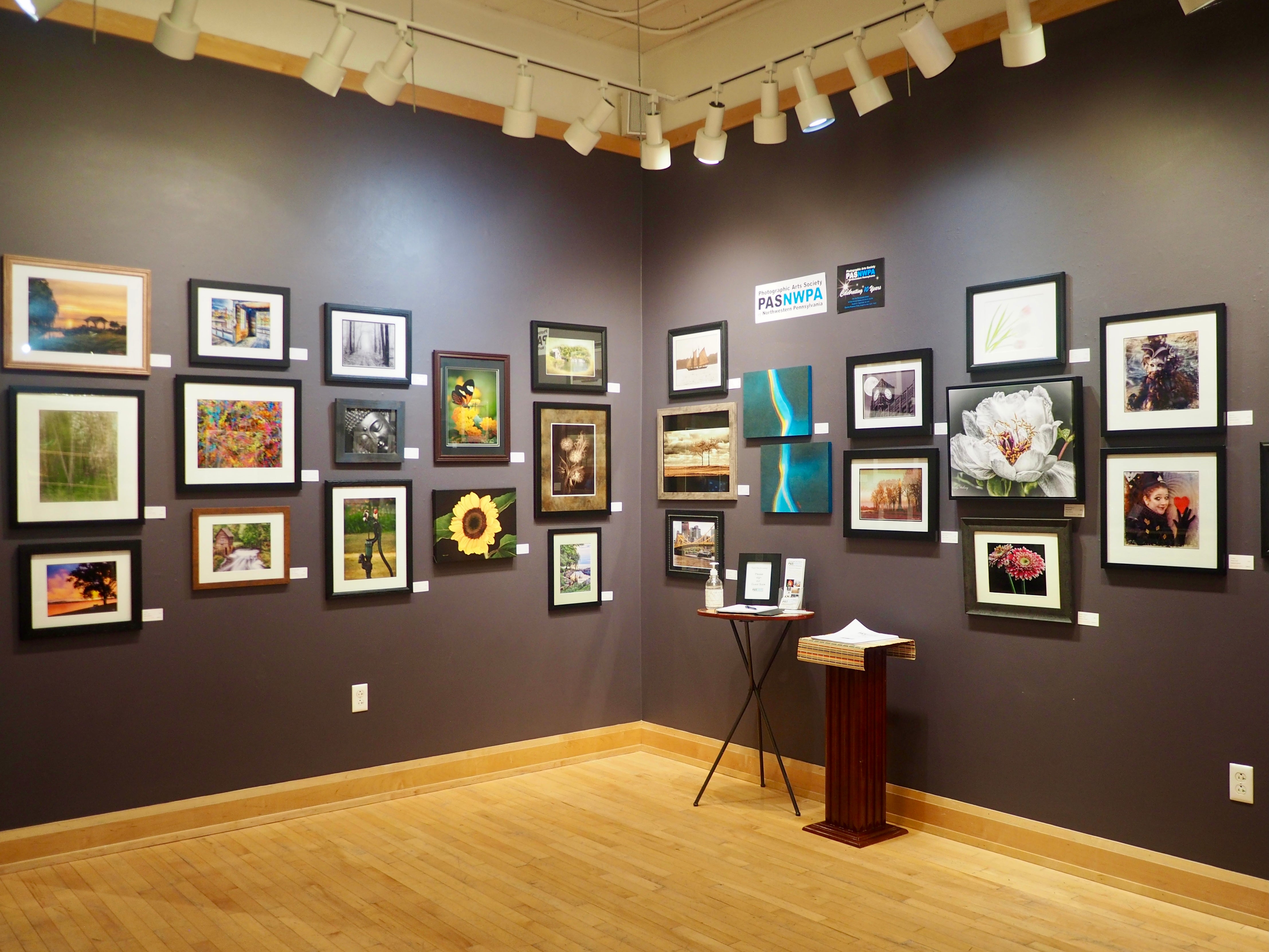
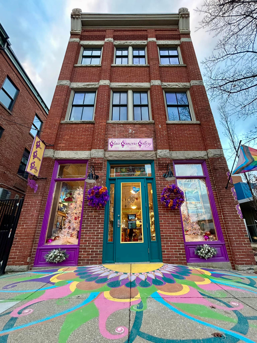
Glass Growers Gallery offers curated art pieces designed to fit any style and budget to make your home a representation of your taste and style. One helpful factor to consider when selecting artwork for your home is color and how individuals perceive different color families.
Color is often associated with emotions and may influence a person’s mental or physical state. Warm colors such as red-orange, reds, yellows, and yellow greens are radiant and cozy. Warm colors seem to advance, making small rooms appear smaller and larger rooms more intimate. Cool colors include purples, blues, and blue-greens and can have a calming effect. In a room, cool colors appear to recede, making a room appear larger. When choosing colors to use for your home decor projects, it's important to think about the mood you want to create and whether you want it to feel light and airy or cozy and intimate. Knowing the difference between warm and cool colors is the first step. Read more at The Spruce here.
Looking to spark your creativity? Warm colors often remind people of sunlight, sand, fire, and heat. Since warm colors often add personality to a space, they are perfect for adding stimulation to bland rooms and balance well with neutral colors as well. Read more at The Spruce here.
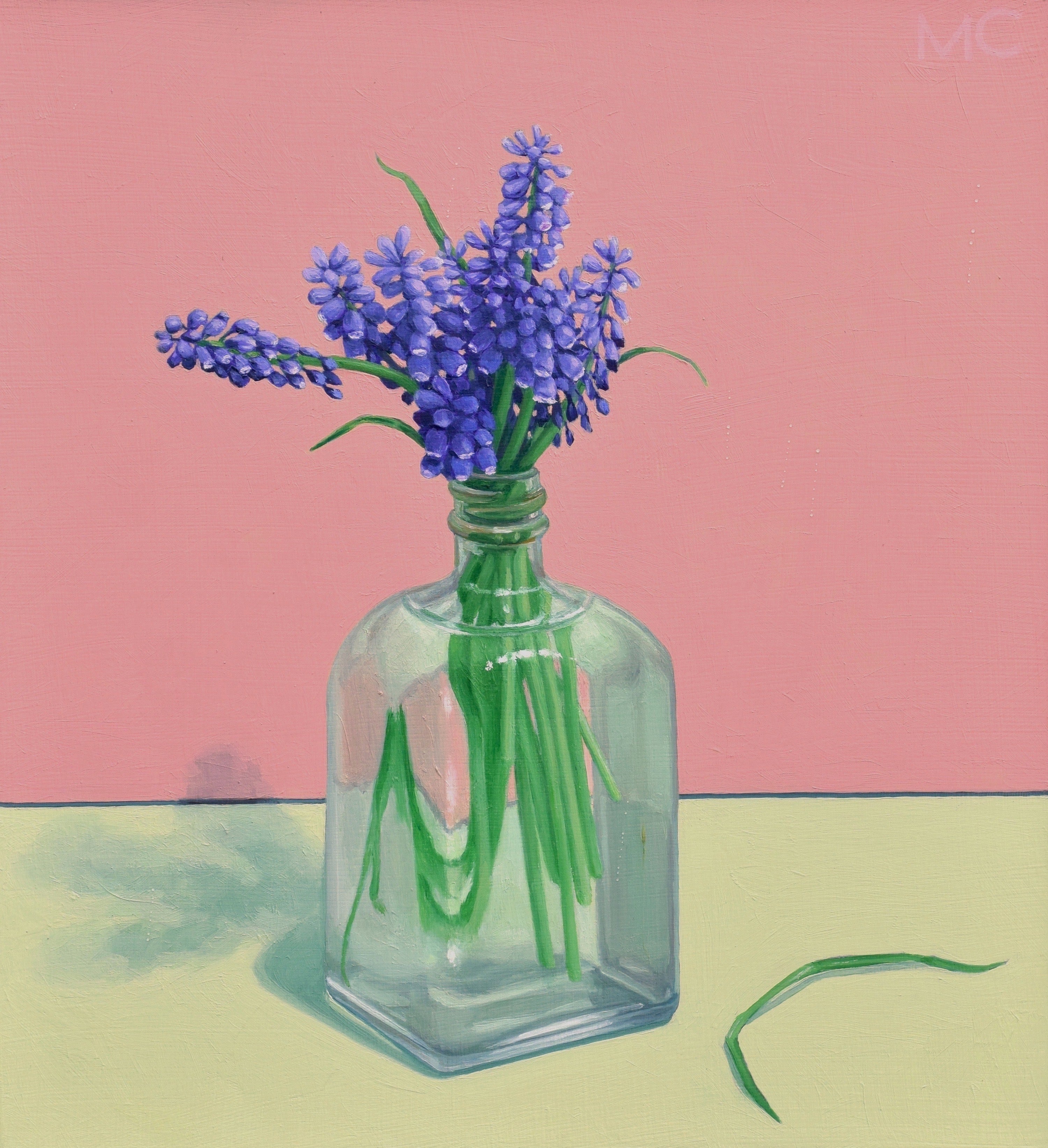
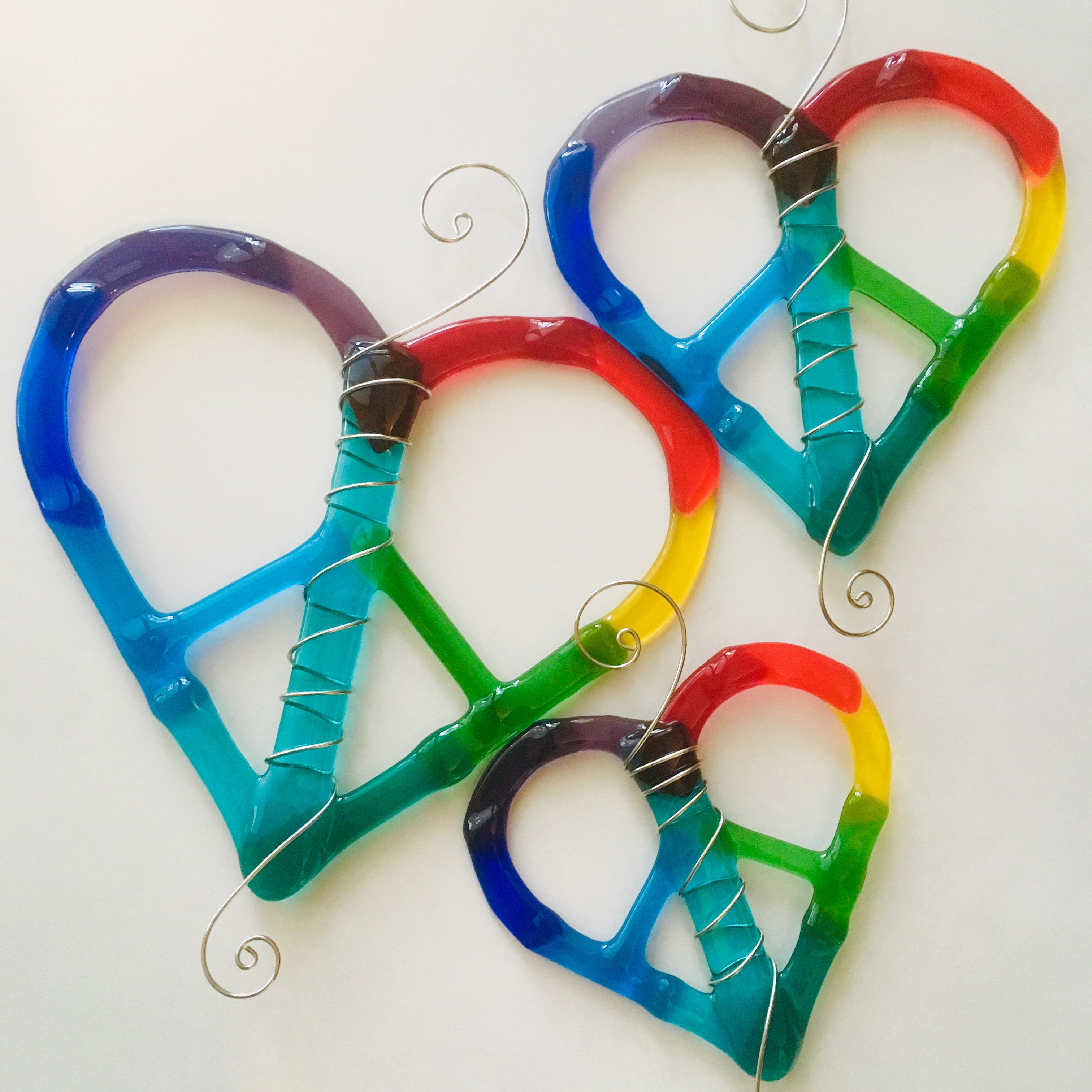
Cool colors are shades of green, blue, and purple. The primary color in this family is blue, so any hue with a blue undertone is considered a cool color. Like water, sky, and greenery in nature, these colors are soothing and bring a sense of calm to a space. Given the impression that cool colors feel fresher, it helps visually to create the appearance of more open space. Colors can play a significant role in our moods and can even enhance our experiences. Read more at The Spruce here.
Utilizing Color Psychology in Home Design
All of these colors can be used around your own home to match the energy you want to feel. For example, cool colors of purple mixed with blue can be used in your study room, office or other room where you want to feel calm, relaxed, and refreshed. Warm colors can be used throughout your whole house to increase energy levels. Color combinations are totally customizable, and Glass Growers Gallery is always here to help you discover your perfect palette.
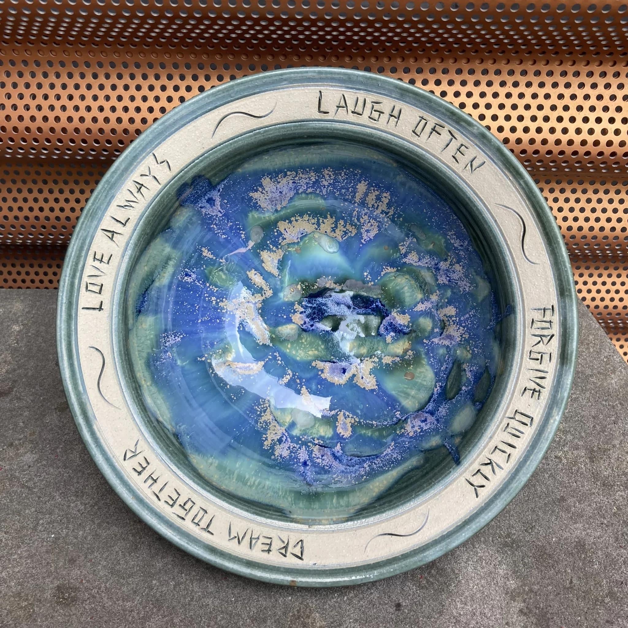
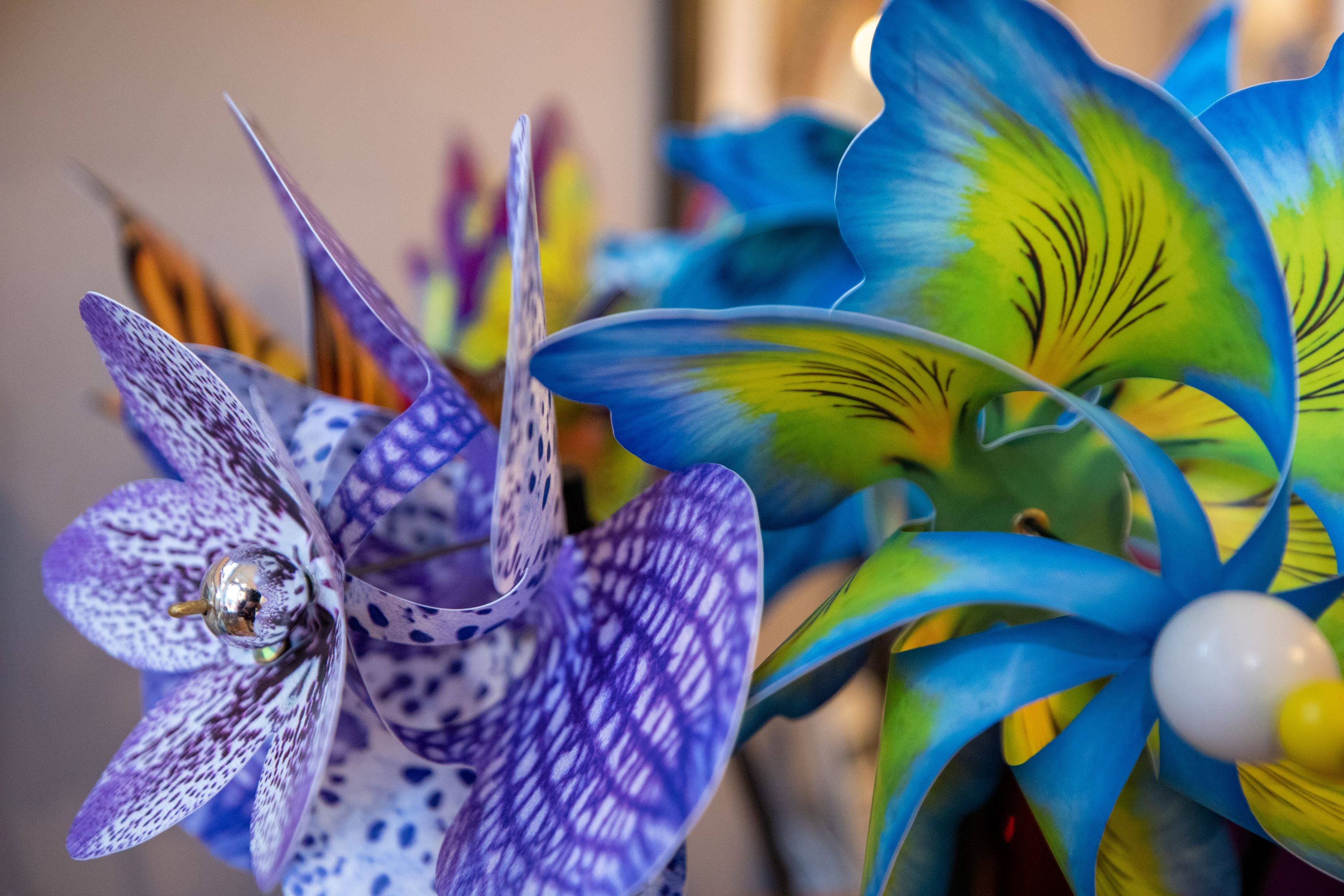
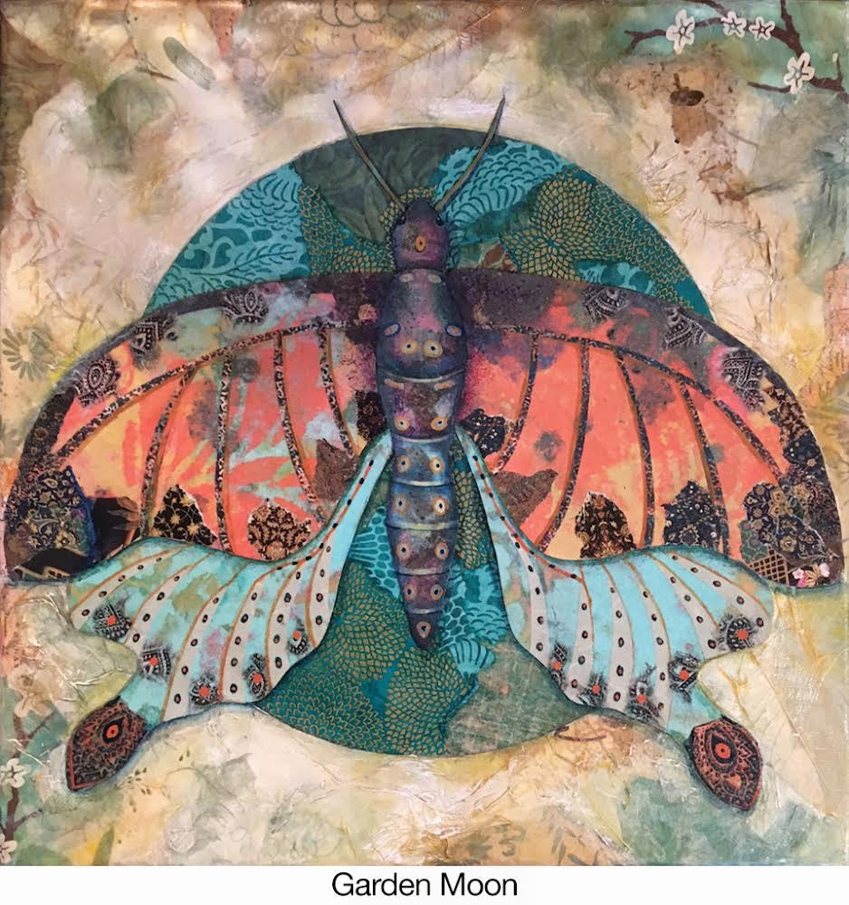
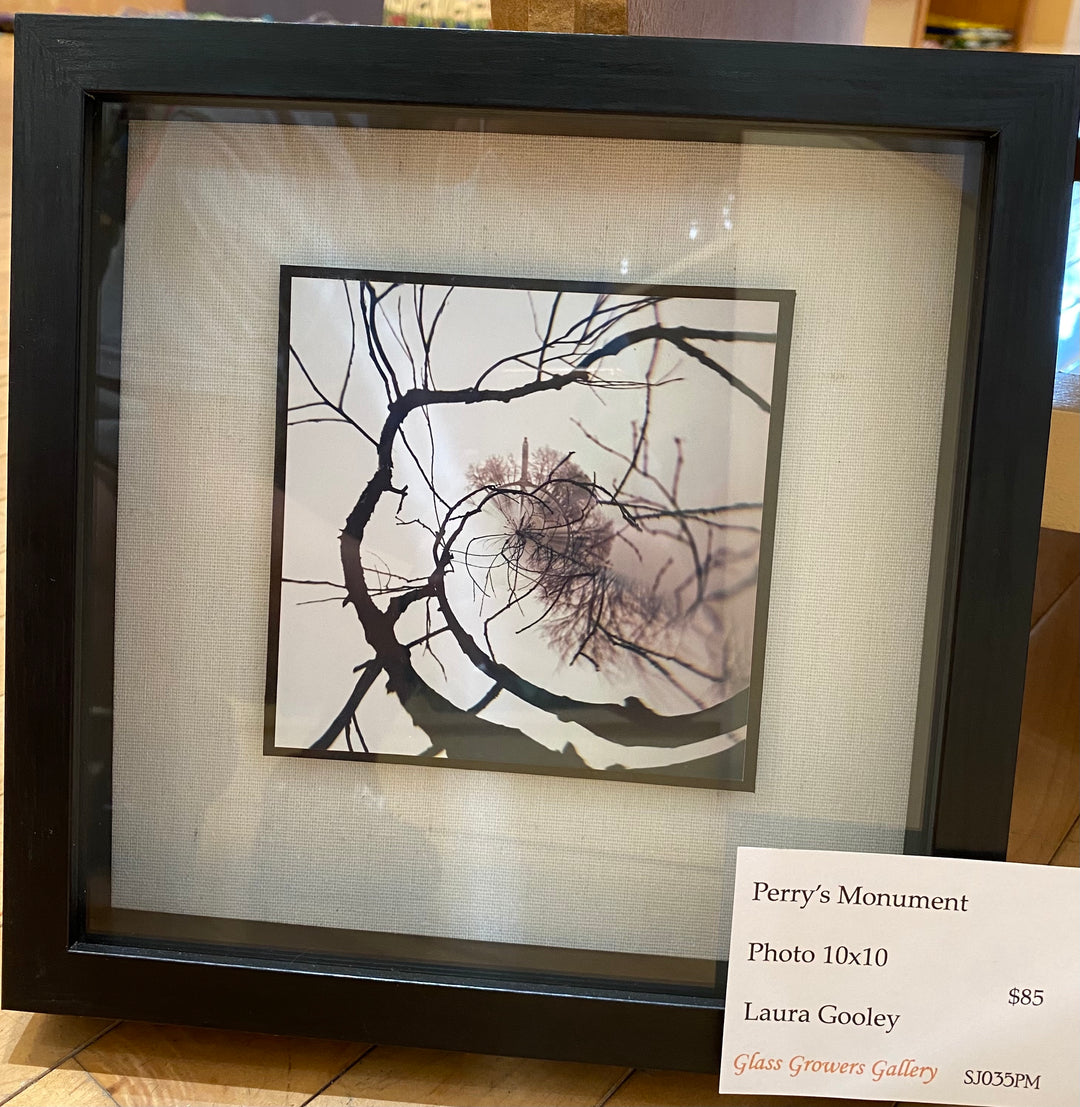
Examples of artwork featuring cool colors:
|
|

|
|

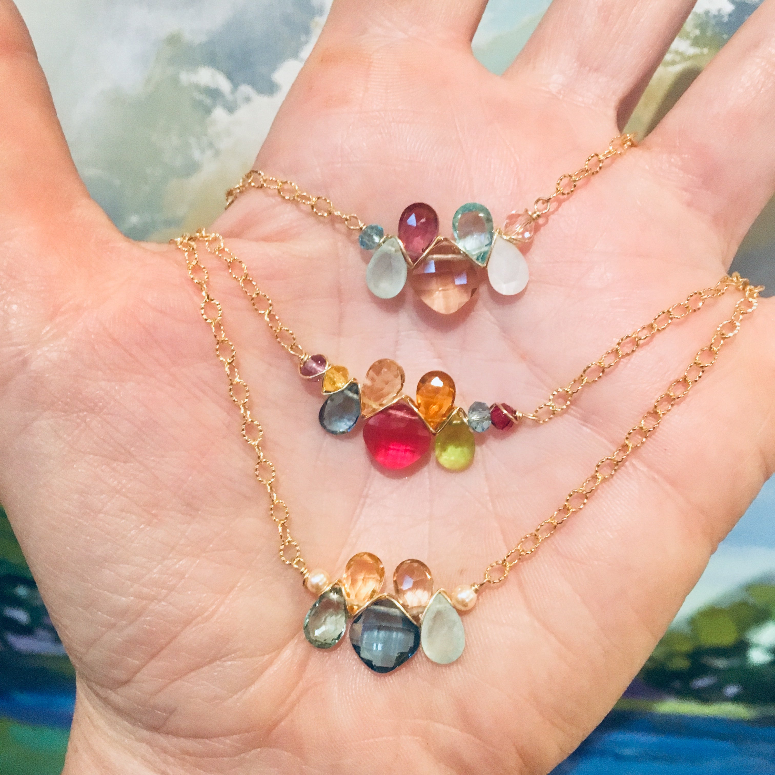
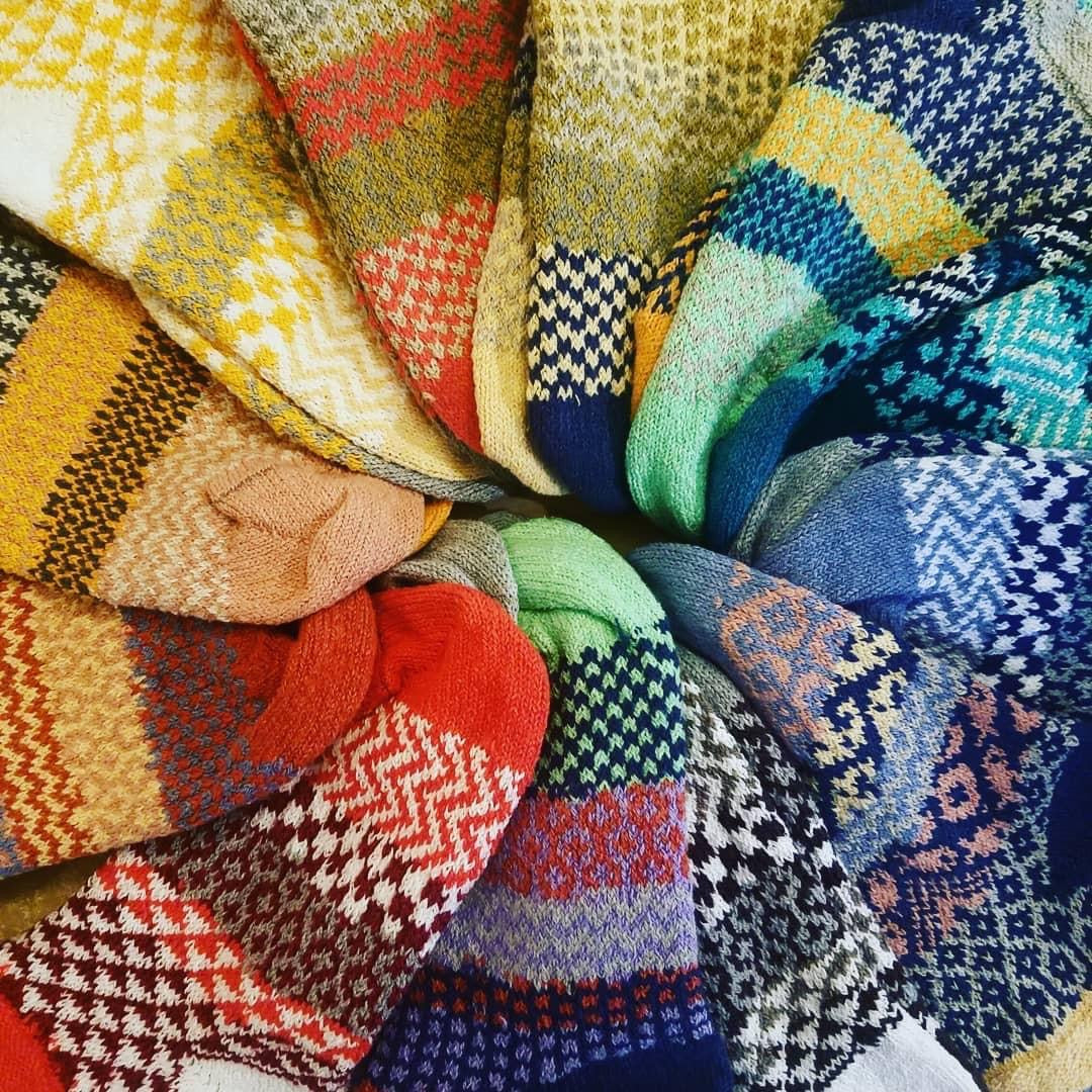
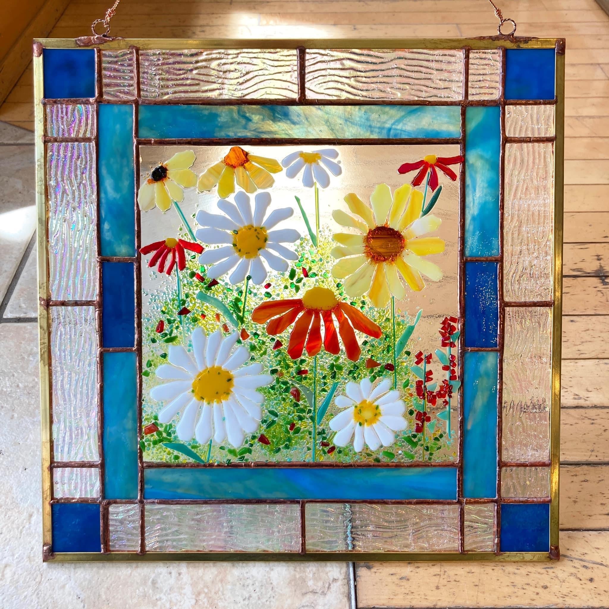
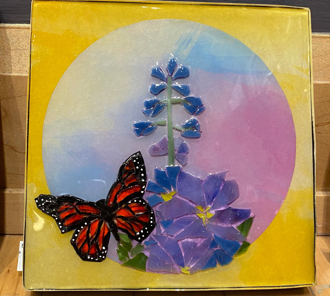
Examples of artwork featuring warm colors:
|
|


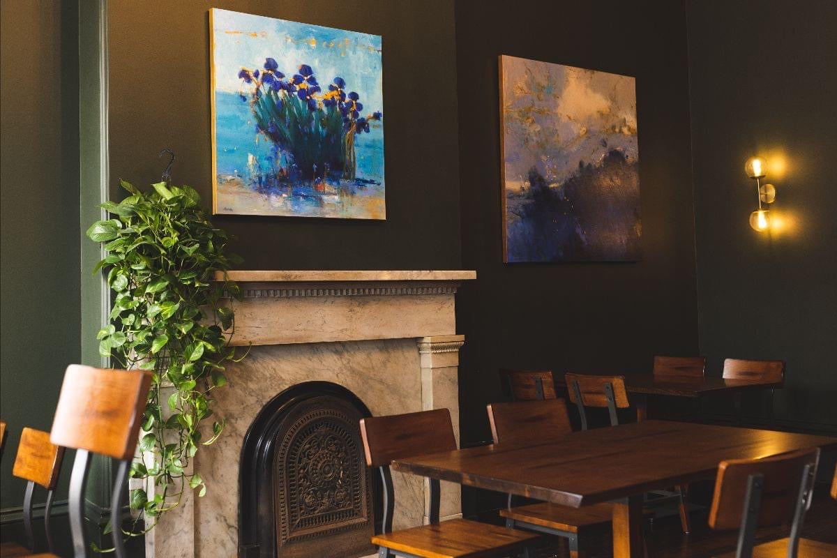
Title: West 2nd Street Dusk
Geoff Dunn
|
Combat Pandemic Fatigue with Colorful Designs and Decor
After a long period of lockdown and disruption to normal life, everyone needed to find outlets to channel emotions. Colors can play a significant role in regulating moods and can even enhance experiences.
Warm colors, such as the ones mentioned above, can be stimulating, making them a good choice for rooms that see a lot of activity. This can have a positive effect on someone’s mental health so it’s important to create a space that will affect individuals in an uplifting manner.
Cool colors make you feel calm, relaxed, and refreshed. That's why cool hues are natural for bedrooms and baths, places where you go to unwind and relax. An example of cool colors and artwork that will affect you positively is “A Gentle & Glimmering Grandeur” by Eddie Mitchell. We offer many beautiful paintings and home decor items that will soothe your mind as well as look perfect in your home.
 Title: A Gentle & Glimmering Grandeur
Eddie Mitchell

Leave a comment